

Kitchen walls set the tone for the whole room, especially in homes where cooking, hosting, and daily cleanup all happen in the same tight space. The right decor can soften plain cabinets, fill awkward blank runs, and add character without turning the room busy. From rustic signs and metal utensils to peel-and-stick tile, this shortlist covers decorative pieces that suit different layouts, budgets, and style goals.
Some options lean farmhouse and warm, while others bring a cleaner, more modern edge. The mix below helps narrow the field quickly, whether the goal is a simple accent above a breakfast nook or a larger surface update behind a sink or stove.
The Shortlist At A Glance

Qunclay 4 Pcs Sunflower Kitchen Wall Decor Mason Jar Set

Hotop 2 Pieces Metal Fork Spoon Wall Decor

Vamos Tile 100-Piece Glossy Wooden Marble Grain Peel and Stick Backsplash Tile
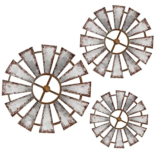
Yookeer 3 Pcs Wood Windmill Wall Decor

Tide and Tales 3d Framed Wall Art, Set of 4

Old Shack Collection Kitchen Wall Decor Set of 4
More Details On Our Top Picks
Warm-toned kitchen walls often need a little structure, and this mason jar and sunflower set leans hard into that job. The wooden pieces suit farmhouse shelves, breakfast nooks, and narrow wall gaps that need more than a single sign. Nothing about the set feels oversized, so it works well in busy kitchens where the decor has to stay light.
The honest read is that the rustic look does most of the work here, which makes this a better fit for casual spaces than sleek modern rooms. Compared with the metal Hotop fork-and-spoon set, this one brings more color and softness, so it feels friendlier in homes that already use wood finishes or matte paint.
Strong Points
- Sunflower and mason jar styling adds warmth without crowding the wall.
- Wood construction suits farmhouse finishes and painted kitchen backdrops.
- The set format makes it easier to fill a small blank span in a balanced way.
- Works well above a coffee station, sideboard, or compact dining nook.
Areas To Watch
- The rustic theme can look busy in minimal or industrial kitchens.
- Wood decor typically needs a bit more care around steam and splashes than coated metal.
Feature Snapshot
Who It Suits Best
Farmhouse kitchens, cottage-style breakfast corners, and homes that lean on warmer wall accents fit this set especially well.
Where A Sibling Pick Shines
The Old Shack Collection Kitchen Wall Decor Set of 4 suits someone who wants a cleaner, more polished look with less visual playfulness.
The Hotop set goes straight to the point, using fork and spoon silhouettes in black metal to create a clean kitchen motif. That shape language works best in dining spaces where the wall needs a simple cue, not a full scene. Compared with the Qunclay sunflower set, this one feels more restrained and less decorative.
For a breakfast nook, café-style kitchen, or rental that needs low-fuss wall art, the metal build gives the room a harder edge without taking much visual space. One thing worth considering, the look depends on the wall color, since the dark finish shows best against lighter paint or tile.
What We Like
- Metal construction gives the design a crisp, tidy outline.
- Fork and spoon shapes read clearly from across the room.
- The black finish pairs well with white, cream, or wood-toned kitchens.
- Two-piece format keeps installation and spacing straightforward.
Room For Improvement
- The theme is narrow, so it has less visual variety than framed or painted decor.
- Dark metal can feel stark in very soft or pastel kitchens.
Core Details
Built With In Mind
Homes with simple dining walls, compact kitchens, or industrial-leaning finishes get the most from this set.
A Better Fit Elsewhere
Yookeer 3 Pcs Wood Windmill Wall Decor suits anyone who wants a softer farmhouse look with more dimension and ornament.
This Vamos Tile set sits in a different lane from the wall art picks, because it updates the surface itself rather than adding a hanging accent. The 3 by 6 subway-tile format, paired with peel-and-stick backing, suits backsplashes, fireplaces, and bathroom walls where a cleaner visual field matters. It can shift the whole mood of a kitchen faster than a sign or sculpture.
The trade-off shows up in the install side, since a tile-style layout asks for more patience and planning than the simpler decor pieces above. In most kitchens, that makes it better for someone who wants a more finished look and doesn’t mind handling a larger project.
Upsides
- Peel-and-stick format keeps the project less involved than traditional tile work.
- Glossy wood-grain look adds depth to plain surfaces.
- White grout styling helps the pattern read cleanly and evenly.
- Works across kitchen, bathroom, and fireplace settings.
Points To Note
- Surface prep matters, since textured or dusty walls can complicate adhesion.
- The tiled format asks for more layout planning than a single wall sign.
- Best suited to longer-term placement rather than quick seasonal changes.
Details At A Glance
Right Fit For
Kitchen renovators, apartment dwellers, and anyone wanting a backsplash-style update without traditional tile work are the clearest match.
Swap It Out When
Tide and Tales 3d Framed Wall Art, Set of 4 suits spaces that need a faster decorative refresh instead of a full surface treatment.
The Yookeer windmill set brings a layered farmhouse look that feels a little more dimensional than a flat sign. In a kitchen, breakfast area, or cottage-style living space, that extra texture helps the wall feel planned rather than accidental. Compared with the Hotop metal utensils, it has a softer country profile and a more decorative silhouette.
For wall space that needs shape as much as color, the windmill design does a steady job without leaning flashy. The honest read is that it works best where rustic wood finishes already have a role, because the theme carries the room more than plain paint does.
Best Bits
- Three-piece layout gives the wall a fuller, layered look.
- Wood windmill forms bring strong farmhouse character.
- Works in kitchens, bedrooms, nurseries, and shared family spaces.
- The set helps fill medium wall sections without needing a large single panel.
Softer Spots
- The rustic theme can feel too specific for modern or polished interiors.
- Wood decor usually benefits from gentle cleaning and careful placement near moisture.
Feature Rundown
Who Will Love This
Country-style kitchens, cottage interiors, and rooms with mixed wood accents suit this set especially well.
Look Elsewhere When
Qunclay 4 Pcs Sunflower Kitchen Wall Decor Mason Jar Set fits better for anyone who wants more color and a gentler seasonal feel.
The Tide and Tales set has a more finished gallery feel than the more rustic picks in this lineup. Four framed pieces, each in a 7 by 16 inch size, give the wall rhythm without forcing a single oversized focal point. That makes it useful in kitchens that connect to living spaces, where the decor has to work from several angles.
Compared with the Yookeer windmills, this set feels cleaner and easier to blend with boho, farmhouse, or soft transitional rooms. The wooden build keeps it grounded, though the lighter construction also means it reads best as a decorative layer rather than a heavy statement piece.
Highlights
- Four-piece arrangement offers more layout flexibility than a single plaque.
- Ready-to-hang format reduces setup friction.
- Lightweight wooden construction suits apartments and shared walls.
- Boho floral styling bridges farmhouse and softer modern decor.
- Multi-room use makes it easier to move the set over time.
Minor Gripes
- The floral look may feel too decorative for very strict minimalist kitchens.
- Lightweight wall art can be more placement-sensitive on textured surfaces.
Quick Facts
Whose Shelf It Belongs On
Homes that mix boho accents, farmhouse pieces, and lighter framed decor are the clearest match here.
Where Shoppers Go Wrong
Hotop 2 Pieces Metal Fork Spoon Wall Decor is the safer route for kitchens that need a simpler, more literal food-themed accent.
The Old Shack Collection set leans into a cleaner kitchen-wall look than the more playful sunflower or windmill options. Four matching signs give the room a composed, coordinated feel, which suits kitchens where the goal is a tidy finish rather than a themed accent. For homes that already have enough color, this quieter style keeps the wall from feeling crowded.
At 8 by 5 inches per sign, the pieces are small enough to fit over a narrow span, yet still visible as a group. The trade-off is simple, the decor is more restrained than the boho or farmhouse sets above, so it rewards spaces that value order and polish over ornament.
Positives
- Four-piece set makes it easier to build a balanced wall arrangement.
- Compact sign size helps in tighter kitchen areas.
- Refined styling suits homes that want decor without visual clutter.
- Works well near cabinets, entry walls, or small breakfast corners.
Small Caveats
- The quieter look may feel understated in rooms that need a stronger focal point.
- Small signs can disappear on very large blank walls.
- Like most sign sets, spacing matters more than the piece count alone.
Spec Overview
Made For
Smaller kitchens, pared-back interiors, and households that want a neater wall finish benefit most from this set.
Another Choice May Suit
Tide and Tales 3d Framed Wall Art, Set of 4 fits better for spaces that need a softer visual texture and a more decorative profile.
How To Choose The Right decorations for kitchen wall
Match The Material To The Room
Wood brings warmth, but it also suits drier spots better than a wall directly beside a steam-heavy range. Metal offers a cleaner line and tends to pair well with white tile, black fixtures, or industrial cabinets. Peel-and-stick tile changes the room more deeply, so it works best where a backsplash-style update makes sense.
The right material also changes upkeep. Flat signs are easy to dust, while layered wood and sculpted metal need a little more care around corners and edges.
Size Matters More Than Style
Small wall signs can disappear above a wide countertop. Larger sets, or grouped pieces like the Tide and Tales and Qunclay options, create better balance across a blank run.
Scale also affects how busy the kitchen feels. Narrow spaces suit compact sets, while open breakfast walls can carry a more detailed look without turning cluttered.
Think About Room Mood First
Farmhouse decor works well in kitchens that already use wood, woven textures, or warm paint. Cleaner metal pieces fit spaces that lean simple and modern. Boho framed art sits neatly between those two, especially in homes that mix soft color with practical finishes.
That mood choice matters because kitchen walls sit in plain sight all day. A good match should feel like part of the room, not a sticker added after the fact.
Things Worth Knowing First
Wrong Turns To Avoid
Many kitchen-wall shoppers focus on the artwork before checking size and placement. That usually leads to pieces that feel too small for a wide wall or too busy for a narrow one. Finish matters too, since glossy, matte, wood, and metal each behave differently beside light and steam.
Another common miss is choosing a style that clashes with cabinet color or backsplash tone. A simple match between material and room finish usually gives a better result than chasing a trend.
The Case For Spending Up
Higher-tier pieces in this category usually cost more because of stronger materials, more detailed construction, or a set format that covers wall space more cleanly. Peel-and-stick tile also asks for tighter printing, more layers, and a more exact fit than a simple sign.
Paying more makes sense when the kitchen wall is highly visible every day or when the decor needs to do more than fill a gap. For low-traffic corners, a simpler piece often does the job just fine.
Final Thoughts
Decorations for kitchen wall work best when they match the room’s actual rhythm, not just the style shown in a product photo. A rustic set can warm up a plain kitchen, a metal utensil piece can keep things tidy, and peel-and-stick tile can shift the whole surface with far more visual weight. The strongest choice is the one that fits the wall size, the finish around it, and the amount of attention that space should hold. A calm, well-matched wall usually ages better than a loud one.
